Animal shelter in Austin, Texas - data analysis
I went through the Austin Animal Center’s records to see how animals arrive, how they leave, and how long they stay. The data comes from the City of Austin Open Data Portal.
importing the packages
import pandas as pd
import numpy as np
import seaborn as sns
import matplotlib as mpl
import matplotlib.pyplot as plt
import missingno as msno
import holoviews as hv
import plotly
import pywaffle as waff
import httpimport
import alluvial
plt.style.use('ggplot')
red = (226/255, 74/255, 51/255)
blue = (52/255, 138/255, 189/255)
loading the data from the csv files
intakes_df = pd.read_csv('intakes.csv')
outcomes_df = pd.read_csv('outcomes.csv')
dataset overview
print('intakes.csv')
display(intakes_df.head(3))
print('outcomes.csv')
display(outcomes_df.head(3))
intakes.csv
| Animal ID | Name | DateTime | MonthYear | Found Location | Intake Type | Intake Condition | Animal Type | Sex upon Intake | Age upon Intake | Breed | Color | |
|---|---|---|---|---|---|---|---|---|---|---|---|---|
| 0 | A786884 | *Brock | 01/03/2019 04:19:00 PM | January 2019 | 2501 Magin Meadow Dr in Austin (TX) | Stray | Normal | Dog | Neutered Male | 2 years | Beagle Mix | Tricolor |
| 1 | A706918 | Belle | 07/05/2015 12:59:00 PM | July 2015 | 9409 Bluegrass Dr in Austin (TX) | Stray | Normal | Dog | Spayed Female | 8 years | English Springer Spaniel | White/Liver |
| 2 | A724273 | Runster | 04/14/2016 06:43:00 PM | April 2016 | 2818 Palomino Trail in Austin (TX) | Stray | Normal | Dog | Intact Male | 11 months | Basenji Mix | Sable/White |
outcomes.csv
| Animal ID | Name | DateTime | MonthYear | Date of Birth | Outcome Type | Outcome Subtype | Animal Type | Sex upon Outcome | Age upon Outcome | Breed | Color | |
|---|---|---|---|---|---|---|---|---|---|---|---|---|
| 0 | A794011 | Chunk | 05/08/2019 06:20:00 PM | May 2019 | 05/02/2017 | Rto-Adopt | NaN | Cat | Neutered Male | 2 years | Domestic Shorthair Mix | Brown Tabby/White |
| 1 | A776359 | Gizmo | 07/18/2018 04:02:00 PM | Jul 2018 | 07/12/2017 | Adoption | NaN | Dog | Neutered Male | 1 year | Chihuahua Shorthair Mix | White/Brown |
| 2 | A821648 | NaN | 08/16/2020 11:38:00 AM | Aug 2020 | 08/16/2019 | Euthanasia | NaN | Other | Unknown | 1 year | Raccoon | Gray |
print('intakes.csv:')
intakes_df.info()
print('\noutcomes.csv:')
outcomes_df.info()
intakes.csv:
<class 'pandas.core.frame.DataFrame'>
RangeIndex: 138585 entries, 0 to 138584
Data columns (total 12 columns):
 #   Column            Non-Null Count   Dtype
---  ------            --------------   -----
 0   Animal ID         138585 non-null  object
 1   Name              97316 non-null   object
 2   DateTime          138585 non-null  object
 3   MonthYear         138585 non-null  object
 4   Found Location    138585 non-null  object
 5   Intake Type       138585 non-null  object
 6   Intake Condition  138585 non-null  object
 7   Animal Type       138585 non-null  object
 8   Sex upon Intake   138584 non-null  object
 9   Age upon Intake   138585 non-null  object
 10  Breed             138585 non-null  object
 11  Color             138585 non-null  object
dtypes: object(12)
memory usage: 12.7+ MB

outcomes.csv:
<class 'pandas.core.frame.DataFrame'>
RangeIndex: 138769 entries, 0 to 138768
Data columns (total 12 columns):
 #   Column            Non-Null Count   Dtype
---  ------            --------------   -----
 0   Animal ID         138769 non-null  object
 1   Name              97514 non-null   object
 2   DateTime          138769 non-null  object
 3   MonthYear         138769 non-null  object
 4   Date of Birth     138769 non-null  object
 5   Outcome Type      138746 non-null  object
 6   Outcome Subtype   63435 non-null   object
 7   Animal Type       138769 non-null  object
 8   Sex upon Outcome  138768 non-null  object
 9   Age upon Outcome  138764 non-null  object
 10  Breed             138769 non-null  object
 11  Color             138769 non-null  object
dtypes: object(12)
memory usage: 12.7+ MB
data size
intakes starts with 138,585 records, and outcomes with 138,769.
feature list
Both datasets have 12 features. pandas types them all as object (string).
The datasets share these common features, with value types in brackets:
Animal ID[str] - unique animal identifierName[str] - the animal’s nameDateTime[datetime] - timestamp of intake (in) or outcome (out)MonthYear[date] - month and year of intake (in) or outcome (out)Animal Type[categorical nominal] - species of animalIntake-Outcome Type[categorical nominal] - how the animal arrived (in) or left (out)Sex upon Intake-Outcome[categorical nominal] - animal’s sex, with spay/neuter statusAge upon Intake-Outcome[int] - animal’s age at intake (in) or outcome (out)Breed[categorical nominal] - animal’s breedColor[categorical nominal] - animal’s color
intakes also has:
Found Location[categorical nominal] - where the animal was foundIntake Condition[categorical nominal] - animal’s condition when admitted
outcomes also has:
Date of Birth[date] - animal’s date of birthOutcome Subtype[categorical nominal] - subcategory of the outcome type
missing values
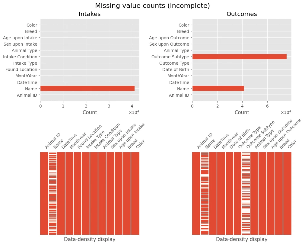
The first info dump flags missing values in these columns:
intakeshasName,Sex upon IntakeoutcomeshasName,Outcome Type,Outcome Subtype,Sex upon Outcome,Age upon Outcome
I’ll deal with the remaining gaps as I go through the features below.
def subplot_missing_values(ax, data, title):
    ax.barh(data.index, data)
    ax.set_title(title)
    ax.set_xlabel('Count')
    ax.ticklabel_format(axis='x', style='sci', scilimits=(0,0), useMathText=True)

def subplot_missing_values_matrix(ax, data):
    msno.matrix(data, fontsize=10, sparkline=False, ax=ax, color=red)
    ax.set_xlabel('Data-density display')
    ax.get_yaxis().set_visible(False)

def plot_missing(df1, name1, df2, name2, *, title='Missing value counts (incomplete)'):
    fig, axes = plt.subplots(2, 2, figsize=(10, 8), layout='constrained')
    fig.suptitle(title, fontsize=16)
    subplot_missing_values(axes[0][0], df1.isna().sum(axis=0), name1)
    subplot_missing_values(axes[0][1], df2.isna().sum(axis=0), name2)
    subplot_missing_values_matrix(axes[1][0], df1)
    subplot_missing_values_matrix(axes[1][1], df2)
plot_missing(intakes_df, 'Intakes', outcomes_df, 'Outcomes')
unique feature values
print('intakes.csv:')
display(intakes_df.nunique())
print(intakes_df.apply(lambda col: col.unique()))

print('\noutcomes.csv:')
display(outcomes_df.nunique())
print(outcomes_df.apply(lambda col: col.unique()))
intakes.csv:


Animal ID           123890
Name                 23544
DateTime             97442
MonthYear              103
Found Location       58367
Intake Type              6
Intake Condition        15
Animal Type              5
Sex upon Intake          5
Age upon Intake         54
Breed                 2741
Color                  616
dtype: int64


Animal ID           [A786884, A706918, A724273, A665644, A682524, ...
Name                [*Brock, Belle, Runster, nan, Rio, Odin, Beowu...
DateTime            [01/03/2019 04:19:00 PM, 07/05/2015 12:59:00 P...
MonthYear           [January 2019, July 2015, April 2016, October ...
Found Location      [2501 Magin Meadow Dr in Austin (TX), 9409 Blu...
Intake Type         [Stray, Owner Surrender, Public Assist, Wildli...
Intake Condition    [Normal, Sick, Injured, Pregnant, Nursing, Age...
Animal Type                        [Dog, Cat, Other, Bird, Livestock]
Sex upon Intake     [Neutered Male, Spayed Female, Intact Male, In...
Age upon Intake     [2 years, 8 years, 11 months, 4 weeks, 4 years...
Breed               [Beagle Mix, English Springer Spaniel, Basenji...
Color               [Tricolor, White/Liver, Sable/White, Calico, T...
dtype: object

outcomes.csv:


Animal ID           124068
Name                 23425
DateTime            115364
MonthYear              103
Date of Birth         7576
Outcome Type             9
Outcome Subtype         26
Animal Type              5
Sex upon Outcome         5
Age upon Outcome        54
Breed                 2749
Color                  619
dtype: int64


Animal ID           [A794011, A776359, A821648, A720371, A674754, ...
Name                [Chunk, Gizmo, nan, Moose, Princess, Quentin, ...
DateTime            [05/08/2019 06:20:00 PM, 07/18/2018 04:02:00 P...
MonthYear           [May 2019, Jul 2018, Aug 2020, Feb 2016, Mar 2...
Date of Birth       [05/02/2017, 07/12/2017, 08/16/2019, 10/08/201...
Outcome Type        [Rto-Adopt, Adoption, Euthanasia, Transfer, Re...
Outcome Subtype     [nan, Partner, Foster, SCRP, Out State, Suffer...
Animal Type                        [Cat, Dog, Other, Bird, Livestock]
Sex upon Outcome    [Neutered Male, Unknown, Intact Male, Spayed F...
Age upon Outcome    [2 years, 1 year, 4 months, 6 days, 7 years, 2...
Breed               [Domestic Shorthair Mix, Chihuahua Shorthair M...
Color               [Brown Tabby/White, White/Brown, Gray, Buff, O...
dtype: object
the Animal IDs don’t line up with row counts, so some animals come back to the shelter more than once. also Age upon Intake/Outcome mixes units (years, months, days) that need standardizing.
data exploration and cleaning
print(pd.concat([intakes_df.columns.to_series(), outcomes_df.columns.to_series()]).drop_duplicates().tolist())
['Animal ID', 'Name', 'DateTime', 'MonthYear', 'Found Location', 'Intake Type', 'Intake Condition', 'Animal Type', 'Sex upon Intake', 'Age upon Intake', 'Breed', 'Color', 'Date of Birth', 'Outcome Type', 'Outcome Subtype', 'Sex upon Outcome', 'Age upon Outcome']
a few things to clean up before I can do much with this:
- eyeball each feature for the various ways missing values show up, then swap them for
NaN - standardize formats (age to a single unit, dates to one shape)
- cast columns to the right types (category, int, datetime)
- drop redundant features and split the messy ones
Starting with duplicate records.
intakes_df = intakes_df.drop_duplicates()
outcomes_df = outcomes_df.drop_duplicates()
print(intakes_df.shape[0], outcomes_df.shape[0])
138565 138752
after dropping duplicates, intakes_df has 138,565 records and outcomes_df has 138,752.
animal ID
print(sum(intakes_df['Animal ID'].str.startswith('A') == False),
      sum(outcomes_df['Animal ID'].str.startswith('A') == False))
0 0
All Animal ID values start with “A”. The IDs are consistent, and there are no missing values.
name
print(intakes_df['Name'].iloc[:10].tolist())
['*Brock', 'Belle', 'Runster', nan, 'Rio', 'Odin', 'Beowulf', '*Ella', 'Mumble', nan]
Some names have a leading asterisk. I strip those for consistency, and replace entries in Name that just echo the Animal ID with NaN.
intakes_df['Name'] = intakes_df.loc[:, 'Name'].str.removeprefix('*')
outcomes_df['Name'] = intakes_df.loc[:, 'Name'].str.removeprefix('*')

mask = intakes_df['Name'] == intakes_df['Animal ID']
intakes_df.loc[mask, 'Name'] = np.nan
datetime, date of birth
I converted DateTime and Date of Birth to datetime64.
intakes_df['DateTime'] = pd.to_datetime(intakes_df.loc[:, 'DateTime'], format='%m/%d/%Y %H:%M:%S %p')
outcomes_df['DateTime'] = pd.to_datetime(outcomes_df.loc[:, 'DateTime'], format='%m/%d/%Y %H:%M:%S %p')
outcomes_df['Date of Birth'] = pd.to_datetime(outcomes_df.loc[:, 'Date of Birth'], format='%m/%d/%Y')
monthyear
# porovnání hodnot v MonthYear a DateTime
print(sum(intakes_df['MonthYear'].str.split(expand=True)[0] != intakes_df['DateTime'].dt.month_name()),
      sum(intakes_df['MonthYear'].str.split(expand=True)[1].astype('int32') != intakes_df['DateTime'].dt.year))
0 0
MonthYear just duplicates DateTime, so I dropped it.
intakes_df = intakes_df.drop(columns=['MonthYear'], errors='ignore')
outcomes_df = outcomes_df.drop(columns=['MonthYear'], errors='ignore')
the categorical features
print('Animal Type:\t\t', *intakes_df['Animal Type'].unique())
print('Intake Type:\t\t', *intakes_df['Intake Type'].unique())
print('Outcome Type:\t\t', *outcomes_df['Outcome Type'].unique())
print('Intake Condition:\t', *intakes_df['Intake Condition'].unique())
print('Outcome Subtype:\t', *outcomes_df['Outcome Subtype'].unique()[:10], '...')
print('Breed:\t\t\t', *intakes_df['Breed'].unique()[:5], '...')
print('Color:\t\t\t', *intakes_df['Color'].unique()[:10], '...')
print('Found Location:\t\t', *intakes_df['Found Location'].unique()[:4], '...')
Animal Type:   Dog Cat Other Bird Livestock
Intake Type:   Stray Owner Surrender Public Assist Wildlife Euthanasia Request Abandoned
Outcome Type:   Rto-Adopt Adoption Euthanasia Transfer Return to Owner Died Disposal Missing Relocate nan
Intake Condition:  Normal Sick Injured Pregnant Nursing Aged Medical Other Neonatal Feral Behavior Med Urgent Space Med Attn Panleuk
Outcome Subtype:  nan Partner Foster SCRP Out State Suffering Underage Snr Rabies Risk In Kennel ...
Breed:    Beagle Mix English Springer Spaniel Basenji Mix Domestic Shorthair Mix Doberman Pinsch/Australian Cattle Dog ...
Color:    Tricolor White/Liver Sable/White Calico Tan/Gray Chocolate Black Brown Tabby Black/White Cream Tabby ...
Found Location:   2501 Magin Meadow Dr in Austin (TX) 9409 Bluegrass Dr in Austin (TX) 2818 Palomino Trail in Austin (TX) Austin (TX) ...
Values here look fine. I cast these to categorical, and unify the various missing sentinels ('', nan, Unknown) into NaN.
for nanstr in ['', 'nan', 'Unknown']:
    intakes_df = intakes_df.replace(nanstr, np.nan)
    outcomes_df = outcomes_df.replace(nanstr, np.nan)
in_cols = ['Intake Type', 'Intake Condition', 'Animal Type', 'Breed', 'Color', 'Found Location']
out_cols = ['Outcome Type', 'Outcome Subtype', 'Animal Type', 'Breed', 'Color']
intakes_df[in_cols] = intakes_df[in_cols].astype('category')
outcomes_df[out_cols] = outcomes_df[out_cols].astype('category')
def subplot_cat_values(ax, series, *, rot=False, ylabel=True):
    counts = series.value_counts()
    ax.bar(counts.index, counts)
    ax.set_xticks(counts.index)
    ax.tick_params(labelsize=9)
    if rot:
        ax.tick_params(rotation=45)
    ax.set_xlabel(series.name, fontsize=12)
    if ylabel:
        ax.set_ylabel('Count', fontsize=12)
    ax.ticklabel_format(axis='y', style='sci', scilimits=(0,0), useMathText=True)

def plot_cat_values(df, title, c1, c2, c3, rot=False):
    fig = plt.figure( figsize=(10, 8), layout='constrained')
    gs = fig.add_gridspec(2, 3)
    ax1 = fig.add_subplot(gs[0, 0])
    ax2 = fig.add_subplot(gs[0, 1:3])
    ax3 = fig.add_subplot(gs[1, :])

    fig.suptitle(title, fontsize=18)
    subplot_cat_values(ax1, df[c1])
    subplot_cat_values(ax2, df[c2], rot=rot)
    subplot_cat_values(ax3, df[c3], rot=rot)
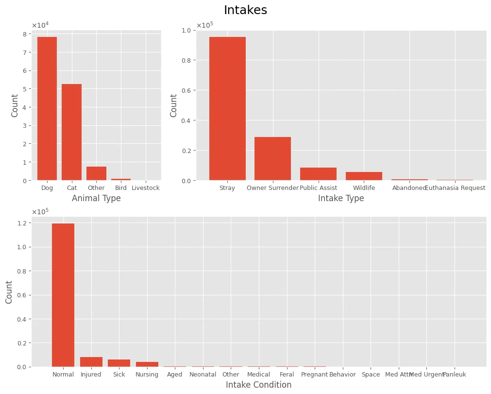
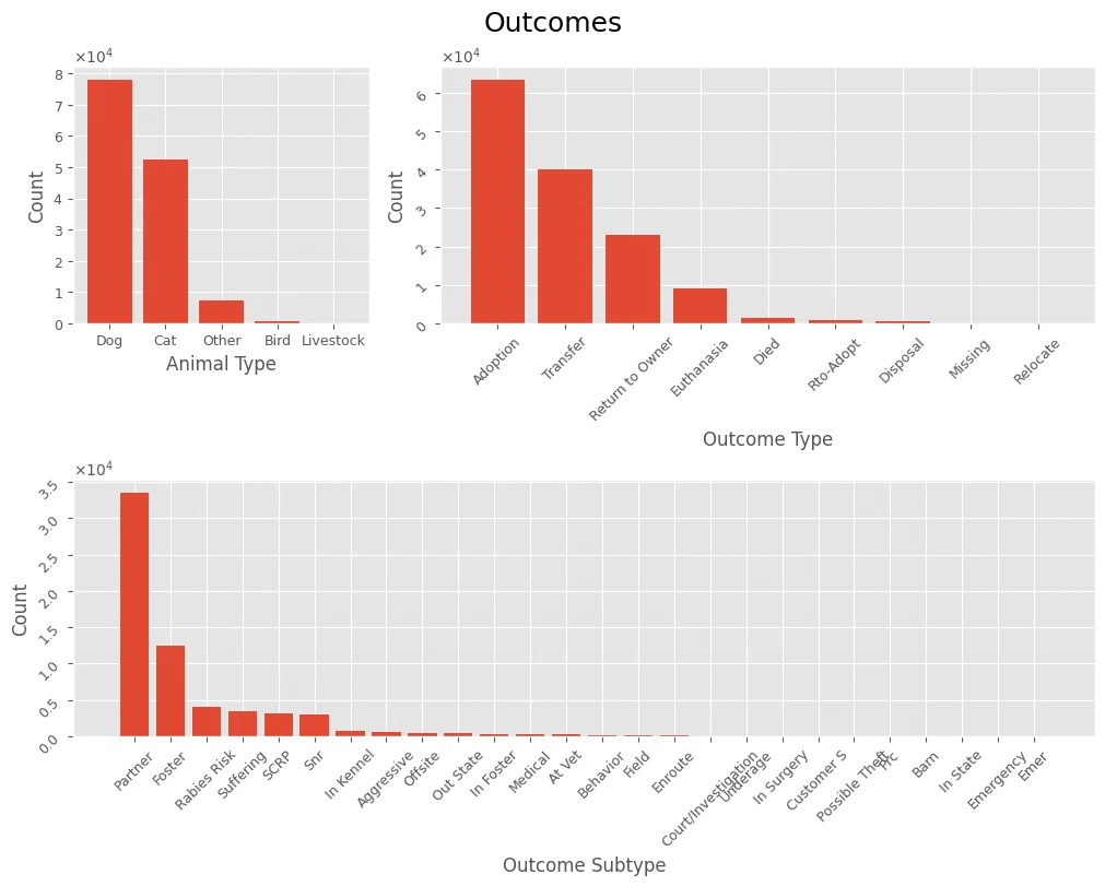
For the few-category features, plotting value counts gives a feel for the shape. No conclusions yet.
plot_cat_values(intakes_df, 'Intakes', *['Animal Type', 'Intake Type', 'Intake Condition'], rot=False)
plot_cat_values(outcomes_df, 'Outcomes', *['Animal Type', 'Outcome Type', 'Outcome Subtype'], rot=True)
sex upon intake-outcome
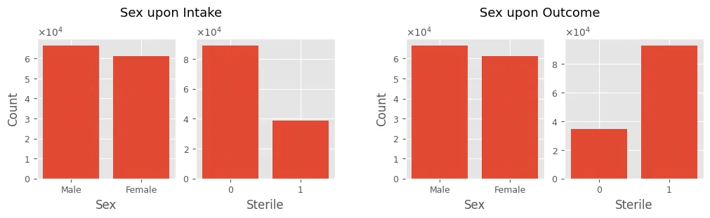
I split each Sex upon Intake/Sex upon Outcome value into a Sterile boolean and a Sex label. Neutered and spayed animals get Sterile set to True, intact ones to False. The original column then drops out, and the two new ones become categorical.
A couple of data quirks come up in the analysis section below.
print('Sex upon Intake:\t', intakes_df['Sex upon Intake'].unique())
print('Sex upon Outcome:\t', outcomes_df['Sex upon Outcome'].unique())
Sex upon Intake:  ['Neutered Male' 'Spayed Female' 'Intact Male' 'Intact Female' nan]
Sex upon Outcome:  ['Neutered Male' nan 'Intact Male' 'Spayed Female' 'Intact Female']
# split
intakes_df[['Sterile', 'Sex']] = intakes_df['Sex upon Intake'].str.split(expand=True)
outcomes_df[['Sterile', 'Sex']] = outcomes_df['Sex upon Outcome'].str.split(expand=True)
sterilMap = {'Neutered': True, 'Spayed': True, 'Intact': False}
intakes_df['Sterile'] = intakes_df['Sterile'].map(sterilMap)
outcomes_df['Sterile'] = outcomes_df['Sterile'].map(sterilMap)

# drop
intakes_df = intakes_df.drop(columns=['Sex upon Intake'])
outcomes_df = outcomes_df.drop(columns=['Sex upon Outcome'])
cols = ['Sterile', 'Sex']
intakes_df[cols] = intakes_df[cols].astype('category')
outcomes_df[cols] = outcomes_df[cols].astype('category')
fig = plt.figure(figsize=(10, 3), layout='constrained')
(fig1, fig2) = fig.subfigures(1, 2, wspace=0.1)

axes = fig1.subplots(1, 2)
fig1.suptitle('Sex upon Intake', fontsize=13)
subplot_cat_values(axes[0], intakes_df['Sex'])
subplot_cat_values(axes[1], intakes_df['Sterile'], ylabel=False)

axes = fig2.subplots(1, 2)
fig2.suptitle('Sex upon Outcome', fontsize=13)
subplot_cat_values(axes[0], outcomes_df['Sex'])
subplot_cat_values(axes[1], outcomes_df['Sterile'], ylabel=False)
age upon intake-outcome
intakes_df['Age upon Intake'].unique()
array(['2 years', '8 years', '11 months', '4 weeks', '4 years', '6 years',
       '6 months', '5 months', '14 years', '1 month', '2 months',
       '18 years', '9 years', '4 months', '1 year', '3 years', '4 days',
       '1 day', '5 years', '2 weeks', '15 years', '7 years', '3 weeks',
       '3 months', '12 years', '1 week', '9 months', '10 years',
       '10 months', '7 months', '8 months', '1 weeks', '5 days',
       '0 years', '2 days', '11 years', '17 years', '3 days', '13 years',
       '5 weeks', '19 years', '6 days', '16 years', '20 years',
       '-1 years', '22 years', '23 years', '-2 years', '21 years',
       '-3 years', '25 years', '24 years', '30 years', '28 years'],
      dtype=object)
There are even some negative ages in here. I took their absolute values and converted all ages to days.
the process:
- pull the number out of the unit
- take its absolute value
- convert to total days based on the unit
Along the way the age columns become numeric. 0 years is read as a newborn.
tmp_in = intakes_df['Age upon Intake'].str.split(expand=True)
tmp_out = outcomes_df['Age upon Outcome'].str.split(expand=True)

tmp_in[0] = tmp_in[0].astype('Int64').abs()  # nullable integer
tmp_out[0] = tmp_out[0].astype('Int64').abs()

print(*tmp_in[1].unique())
print(*tmp_out[1].unique())
years months weeks month year days day week
years year months days weeks month day week nan
def convert_ages(tmp_df):
    yearMask = tmp_df[1].isin(['years', 'year'])
    monthMask = tmp_df[1].isin(['months', 'month'])
    weekMask = tmp_df[1].isin(['weeks', 'week'])
    tmp_df.loc[yearMask, 0] = tmp_df.loc[yearMask, 0] * 365
    tmp_df.loc[monthMask, 0] = tmp_df.loc[monthMask, 0] * 30
    tmp_df.loc[weekMask, 0] = tmp_df.loc[weekMask, 0] * 7
    return tmp_df[0]

intakes_df['Age upon Intake'] = convert_ages(tmp_in)
outcomes_df['Age upon Outcome'] = convert_ages(tmp_out)
def subplot_age(ax, data, title):
    ax.set_title(title)
    ax.hist(data, bins=15)
    ax.set_ylabel('Count')
    ax.set_xlabel('Age [years]')
    ax.ticklabel_format(axis='y', style='sci', scilimits=(0,0), useMathText=True)

fig, axes = plt.subplots(1, 2, figsize=(10, 3), layout='constrained')
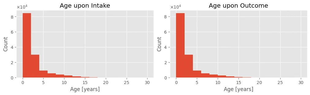
subplot_age(axes[0], intakes_df['Age upon Intake'].dropna()/365, 'Age upon Intake')
subplot_age(axes[1], outcomes_df['Age upon Outcome'].dropna()/365, 'Age upon Outcome')
summary
both datasets now have their features at the right types:
Animal IDandNamestaystring(object)DateTimeandDate of Birthare nowdatetime(datetime64)- the age columns are numeric
int64 - everything else is
category MonthYearis dropped as redundantSex upon Intake-Outcomesplits intoSexandSterile- bad records (negative ages, typos) are fixed and missing values handled
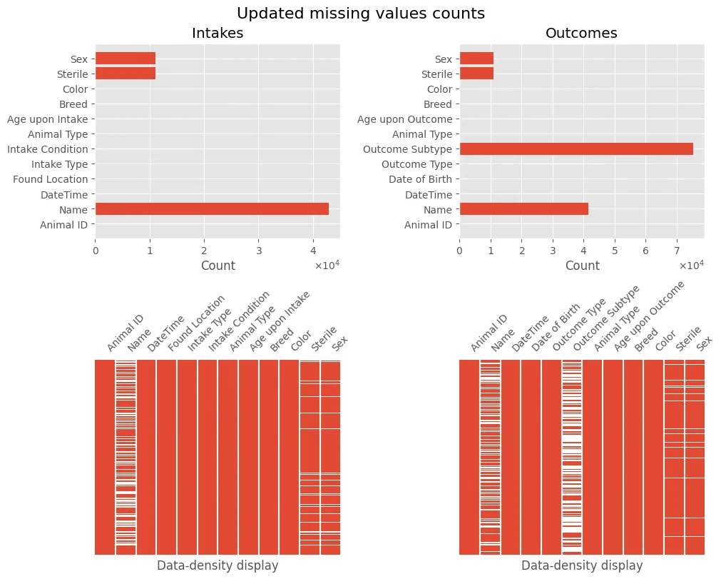
The missing-data picture is clearer now too. The cleaned frames are intakes_df and outcomes_df.
plot_missing(intakes_df, 'Intakes', outcomes_df, 'Outcomes', title='Updated missing values counts')
descriptive statistics
def print_univar_num_stats(series):
    print(series.name, 'statistics')
    print()
    print('min:\t', series.min())
    print('max:\t', series.max())
    print('mean:\t', series.mean())
    print('median:\t', series.median())
    print('range:\t', series.max() - series.min())
    print()
    print('lower quartile:\t', series.quantile(0.25))
    print('upper quartile:\t', series.quantile(0.75))
    print('IQR:\t\t', series.quantile(0.75) - series.quantile(0.25))
    print()
    print('variance:\t', series.var())
    print('std. variation:\t', series.std())
    print('skewness:\t', series.skew())
    print('kurtosis:\t', series.kurtosis())

def print_univar_dt_stats(series):
    print(series.name, 'statistics')
    print()
    print('min:\t', series.min())
    print('max:\t', series.max())
    print('mode:\t', list(series.mode()))
    print('range:\t', series.max() - series.min())

def plot_univar_num(title1, title2, xlabel, ylabel, data, *, bins=15, xlim=None, scinot=False, showfliers=True):
    fig, axes = plt.subplots(1, 2, figsize=(10, 4), layout='constrained', gridspec_kw={'wspace': 0.1})
    ax = axes[0]
    ax.set_title(title1)
    ax.set_ylabel(ylabel)
    ax.set_xlabel(xlabel)
    if scinot:
        ax.ticklabel_format(axis='y', style='sci', scilimits=(0, 0), useMathText=True)
    ax.hist(data, bins=bins)

    medianprops = dict(linewidth=2.5, color=(1, 0.38, 0.27))
    flierprops = dict(marker='d', markerfacecolor=(1, 0.38, 0.27), markersize=8, markeredgecolor='none')
    ax = axes[1]
    ax.set_title(title2)
    ax.set_xlabel(xlabel)
    if xlim != None:
        ax.set_xlim(xlim)
    ax.boxplot(data, vert=False, widths=[0.4], showfliers=showfliers, flierprops=flierprops, medianprops=medianprops)
    ax.get_yaxis().set_visible(False)
age upon intake feature
Univariate stats on Age upon Intake and DateTime (both from the intakes dataset).
age = intakes_df['Age upon Intake'].dropna()
ageY = intakes_df['Age upon Intake'] / 365
age.info()
<class 'pandas.core.series.Series'>
Index: 138565 entries, 0 to 138584
Series name: Age upon Intake
Non-Null Count   Dtype
--------------   -----
138565 non-null  Int64
dtypes: Int64(1)
memory usage: 2.2 MB
print_univar_num_stats(ageY)
Age upon Intake statistics

min:  0.0
max:  30.0
mean:  2.0278033206313832
median:  1.0
range:  30.0

lower quartile:  0.1643835616438356
upper quartile:  2.0
IQR:   1.8356164383561644

variance:  8.170721564564788
std. variation:  2.8584474045475785
skewness:  2.3340016328003066
kurtosis:  5.968203952133479
Age upon Intake is the animal’s age at intake in days after preprocessing. rows with missing values are left out of this part.
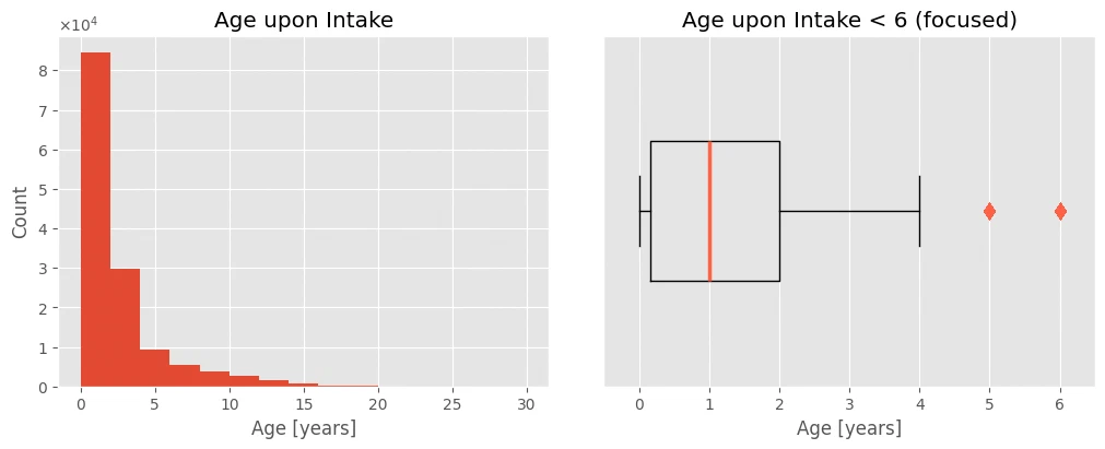
- ages at intake run from 0 (newborns) to 30 years
- mean is just over 2 years, median is 1 year
- the IQR is only 1.8 years, so most animals are young despite the 30-year range
- positive skewness, so the distribution leans right
- high skewness means most values cluster near that 2-year mean
The histogram confirms it, and the cropped boxplot shows that even with a mean of 2, about 75% of animals are younger. The mean gets pulled up by outliers, so the median is the fairer read on a typical shelter animal.
plot_univar_num('Age upon Intake', 'Age upon Intake < 6 (focused)', 'Age [years]', 'Count', ageY, xlim=(-0.5, 6.5), scinot=True)
intakes_df[ageY == 30]
| Animal ID | Name | DateTime | Found Location | Intake Type | Intake Condition | Animal Type | Age upon Intake | Breed | Color | Sterile | Sex | |
|---|---|---|---|---|---|---|---|---|---|---|---|---|
| 132371 | A842878 | Sunshine | 2021-10-30 10:07:00 | 3008 West Avenue in Austin (TX) | Owner Surrender | Other | Bird | 10950 | Macaw | Blue/Gold | False | Female |
The oldest animal on record is a 30-year-old female Macaw named Sunshine.
datetime feature (intakes)
Now the same treatment for DateTime from intakes.
def dt_to_counts(dts):
    dtc = pd.to_datetime(dts).dt.date.value_counts()

    # fill days with no intakes
    idx = pd.date_range(dtc.index.min(), dtc.index.max())
    dtc.index = pd.DatetimeIndex(dtc.index)
    dtc = dtc.reindex(idx, fill_value=0)
    return dtc
dt = intakes_df['DateTime']
dtcount = dt_to_counts(dt)

dt.info()
<class 'pandas.core.series.Series'>
Index: 138565 entries, 0 to 138584
Series name: DateTime
Non-Null Count   Dtype
--------------   -----
138565 non-null  datetime64[ns]
dtypes: datetime64[ns](1)
memory usage: 6.1 MB
print_univar_dt_stats(dt)
DateTime statistics

min:  2013-10-01 01:12:00
max:  2022-04-27 07:54:00
mode:  [Timestamp('2014-07-09 12:58:00'), Timestamp('2016-09-23 12:00:00')]
range:  3130 days 06:42:00
print_univar_num_stats(dtcount)
count statistics

min:  0
max:  140
mean:  44.25582880868732
median:  44.0
range:  140

lower quartile:  34.0
upper quartile:  55.0
IQR:   21.0

variance:  331.17574476812825
std. variation:  18.198234660761145
skewness:  0.26627105755009095
kurtosis:  0.7186242354271446
dtcount[dtcount == dtcount.max()]
2014-07-09    140
Freq: D, Name: count, dtype: int64
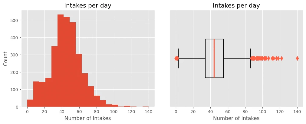
The DateTime feature from the intakes dataset is a temporal feature.
- the earliest intake was on October 1, 2013, the latest on April 27, 2022
- the busiest day was July 9, 2014, when 140 new animals came in
- the average is about 44 intakes per day, with the middle 50% of days between 34 and 55
plot_univar_num('Intakes per day', 'Intakes per day', 'Number of Intakes', 'Count', dtcount, bins=20, showfliers=True)
animal type feature (intakes)
Next, three more features get the univariate treatment.
def plot_univar_cat(title1, title2, xlabel, icons, data, *, prop=1000):
    fig, axes = plt.subplots(1, 2, figsize=(10, 4), layout='constrained', gridspec_kw={'wspace': 0.2})
    ax = axes[0]
    ax.set_title(title1)
    ax.set_xlabel(xlabel)
    ax.ticklabel_format(axis='x', style='sci', scilimits=(0, 0), useMathText=True)
    ax.barh(data.index, data)
    ax.invert_yaxis()

    val = data / prop
    val_freq = val / val.sum()
    waff.Waffle.make_waffle(
        ax=axes[1],
        rows=12,
        values=val,
        title={'label': title2, 'loc': 'center'},
        labels=[f"{k} ({v*100:.2f}%)" for k, v in val_freq.items()],
        legend={'bbox_to_anchor': (1.7, 1), 'ncol': 1, 'framealpha': 0},
        icons=icons,
        font_size=16,
        # icon_style='solid',
        icon_legend=True,
        starting_location='NW',
        vertical=True,
        cmap_name="Set2"
    )
in_type = intakes_df['Animal Type']
in_type_c = in_type.value_counts()
in_type_cnorm = in_type.value_counts(normalize=True)

print('Intakes Animal Type')
display(in_type.info())
Intakes Animal Type
<class 'pandas.core.series.Series'>
Index: 138565 entries, 0 to 138584
Series name: Animal Type
Non-Null Count   Dtype
--------------   -----
138565 non-null  category
dtypes: category(1)
memory usage: 5.2 MB


None
in_type.describe()
count     138565
unique         5
top          Dog
freq       78135
Name: Animal Type, dtype: object
in_type_c
Animal Type
Dog          78135
Cat          52373
Other         7372
Bird           661
Livestock       24
Name: count, dtype: int64
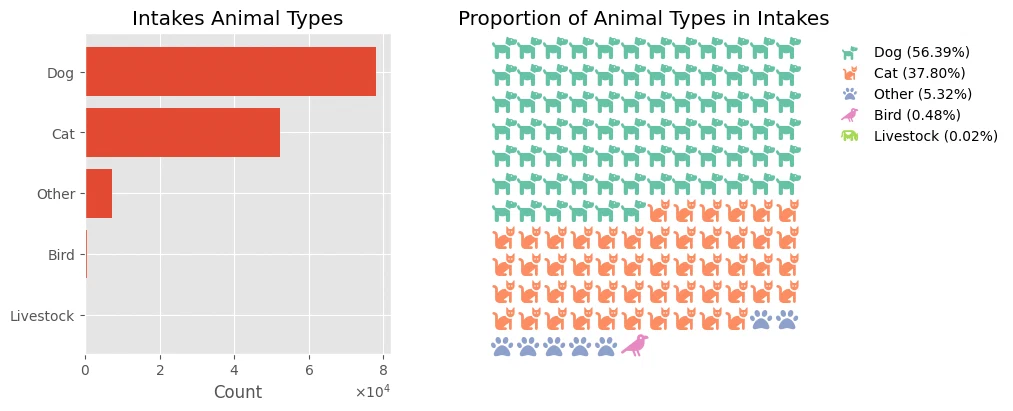
Animal Type is categorical. the five values are Bird, Cat, Dog, Livestock, and Other.
- dogs lead at 56%
- cats take another 37%
- birds, livestock, and “other” make up the rest
- together, dogs and cats cover over 94% of intakes
plot_univar_cat('Intakes Animal Types', 'Proportion of Animal Types in Intakes', 'Count', ['dog', 'cat', 'paw', 'crow', 'cow'], in_type_c)
color feature (intakes)
Now Color, same univariate treatment.
intakes_df['Color'].str.split('/', n=-1).value_counts()
Color
[Black, White]          14469
[Black]                 11613
[Brown Tabby]            7948
[Brown]                  5935
[White]                  4866
                        ...
[Black Tabby, Gray]         1
[Yellow, Red]               1
[Seal Point, Cream]         1
[White, Lilac Point]        1
[Brown Tabby, Tan]          1
Name: count, Length: 616, dtype: int64
len(intakes_df['Color'].unique())
616
cols = intakes_df['Color'].str.split('/', n=-1)
cols = pd.Series(np.concatenate(cols.to_numpy().flatten()))
cols = cols.value_counts()
cols.index, len(cols.index)
(Index(['White', 'Black', 'Brown', 'Tan', 'Brown Tabby', 'Blue', 'Orange Tabby',
        'Tricolor', 'Brown Brindle', 'Red', 'Gray', 'Blue Tabby', 'Tortie',
        'Calico', 'Chocolate', 'Torbie', 'Cream', 'Cream Tabby', 'Fawn',
        'Sable', 'Yellow', 'Buff', 'Lynx Point', 'Blue Merle', 'Gray Tabby',
        'Seal Point', 'Orange', 'Black Brindle', 'Flame Point', 'Black Tabby',
        'Blue Tick', 'Brown Merle', 'Gold', 'Silver', 'Black Smoke', 'Red Tick',
        'Lilac Point', 'Red Merle', 'Tortie Point', 'Silver Tabby',
        'Blue Cream', 'Yellow Brindle', 'Apricot', 'Green', 'Blue Point',
        'Chocolate Point', 'Liver', 'Calico Point', 'Pink', 'Blue Tiger',
        'Brown Tiger', 'Agouti', 'Silver Lynx Point', 'Blue Smoke',
        'Liver Tick', 'Black Tiger', 'Orange Tiger', 'Cream Tiger',
        'Gray Tiger', 'Ruddy'],
       dtype='object'),
 60)
cols.head()
White          61893
Black          43306
Brown          20784
Tan            15939
Brown Tabby    12772
Name: count, dtype: int64
Color is categorical.
- the most common combos at intake are black/white, plain black, and brown
- counting each color separately, most animals are white, black, brown, or tan
- 616 unique color combos from 60 distinct colors
fig, axes = plt.subplots(1, 2, figsize=(10, 5), layout='constrained', gridspec_kw={'wspace': 0.1})
ax = axes[0]
toshow = cols.iloc[:12]
ax.set_title('12 Most Common Animal Colors')
ax.set_xlabel('Count')
ax.ticklabel_format(axis='x', style='sci', scilimits=(0, 0), useMathText=True)
ax.barh(toshow.index, toshow)
ax.invert_yaxis()

ax = axes[1]
ax.set_title('Animal Colors')
t = 6
sumcol = cols.iloc[:t]
sumcol['Other'] = cols.iloc[t:].sum()
patches, _, autotexts = ax.pie(sumcol, labels=sumcol.index, autopct='%1.1f%%', pctdistance=0.8, frame=False,
       colors=['white', '#484848', '#884d3a', '#e1ad8e', '#e0a75d', '#add8e6', '#fbf3d0'],
       wedgeprops={"edgecolor":'black','linewidth': 0.3, 'antialiased': True})
ax.axis('equal')
autotexts[1].set_color('white')
autotexts[2].set_color('white')

intake condition feature
Last one for this pass, Intake Condition.
cond = intakes_df['Intake Condition'].value_counts()
cond
Intake Condition
Normal        119305
Injured         7841
Sick            5997
Nursing         3932
Aged             463
Neonatal         321
Other            245
Medical          174
Feral            125
Pregnant         103
Behavior          49
Space              4
Med Attn           3
Med Urgent         2
Panleuk            1
Name: count, dtype: int64
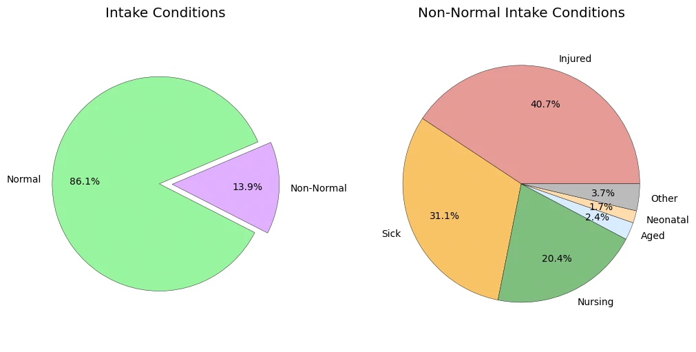
Intake Condition is categorical.
- most animals come in Normal (about 86%)
- the rest are mostly injured (40%), sick (31%), or nursing (20%)
normal = cond.loc['Normal']
nonnormal = cond.loc[cond.index != 'Normal']

fig, axes = plt.subplots(1, 2, figsize=(10, 5), layout='constrained', gridspec_kw={'wspace': 0.1})
# ax = axes[2]
# ax.set_title('Comparison of Non-Normal Intake Conditions')
# ax.set_xlabel('Count')
# ax.ticklabel_format(axis='x', style='sci', scilimits=(0, 0), useMathText=True)
# ax.barh(nonnormal.index, nonnormal)
# ax.invert_yaxis()

ax = axes[0]
ax.set_title('Intake Conditions')
patches, _, autotexts = ax.pie([normal, nonnormal.sum()], labels=['Normal', 'Non-Normal'], autopct='%1.1f%%', pctdistance=0.7, frame=False,
       colors=['#98f59f', '#E0B0FF'], startangle=23, explode=(0, 0.12),
       wedgeprops={"edgecolor":'black','linewidth': 0.3, 'antialiased': True})
ax.axis('equal')

ax = axes[1]
ax.set_title('Non-Normal Intake Conditions')
t = 5
sumcol = nonnormal.iloc[:t]
sumcol['Other'] = nonnormal.iloc[t:].sum()
patches, _, autotexts = ax.pie(sumcol, labels=sumcol.index, autopct='%1.1f%%', pctdistance=0.7, frame=False,
       colors=['#e69b96', '#f9c367', '#7fbf7f', '#d8ecff', '#ffdbac', '#bbb'],
       wedgeprops={"edgecolor":'black','linewidth': 0.3, 'antialiased': True})
ax.axis('equal');
animal origin
I wanted to see whether different kinds of animals arrive at the shelter in different ways.
sample = intakes_df[intakes_df['Animal Type'] == 'Other'].loc[:, 'Breed'].unique()
print(list(sample)[:20])
['Bat', 'Bat Mix', 'Hamster Mix', 'Raccoon', 'Raccoon Mix', 'Rabbit Sh Mix', 'Skunk Mix', 'Cinnamon', 'Rabbit Sh', 'Opossum', 'Skunk', 'Dutch/Angora-Satin', 'Fox', 'Rat', 'Guinea Pig Mix', 'Ferret', 'Cold Water', 'Rat Mix', 'Opossum Mix', 'Guinea Pig']
condtype = intakes_df.loc[:, ['Intake Type', 'Animal Type']].value_counts().unstack().fillna(0).astype(int).transpose()
cm = sns.light_palette(blue, as_cmap=True)
style = condtype.style.background_gradient(axis=1, cmap=cm).set_properties(**{'text-align':'center','font-size':'16px'})
style.map(lambda v: 'opacity: 30%;' if (v == 0) else None)
style.set_caption('Animal Types by Intake Type').set_table_styles([dict(
    selector='caption', props=[('font-size', '150%'), ('text-align', 'left'), ('color', '#555')])])
| Intake Type | Abandoned | Euthanasia Request | Owner Surrender | Public Assist | Stray | Wildlife |
|---|---|---|---|---|---|---|
| Animal Type | ||||||
| Bird | 0 | 3 | 83 | 137 | 328 | 110 |
| Cat | 366 | 59 | 10586 | 1157 | 40205 | 0 |
| Dog | 347 | 183 | 17142 | 6735 | 53727 | 1 |
| Livestock | 0 | 0 | 1 | 1 | 22 | 0 |
| Other | 27 | 14 | 763 | 314 | 993 | 5261 |
Most animals arrive one of three ways.
- birds, cats, and dogs come in mostly as strays or owner surrenders
- “Other” (bats, deer, snakes, frogs, and so on) come in from the wild
- a smaller slice are abandoned, or brought in with a euthanasia request
The heatmap backs this up. Cell color shows how often each pairing shows up in a row.
animal outcomes
and what happens to them when they leave?
types = outcomes_df.loc[:, ['Outcome Subtype', 'Animal Type']].value_counts().unstack().fillna(0).astype(int).transpose().T
cm = sns.light_palette(blue, as_cmap=True)
style = types.style.background_gradient(axis=1, cmap=cm).set_properties(**{'text-align':'center','font-size':'16px'})
style.map(lambda v: 'opacity: 30%;' if (v == 0) else None)
style.set_caption('Animal Types by Outcome Type').set_table_styles([dict(
    selector='caption', props=[('font-size', '150%'), ('text-align', 'left'), ('color', '#555')])])
| Animal Type | Bird | Cat | Dog | Livestock | Other |
|---|---|---|---|---|---|
| Outcome Subtype | |||||
| Aggressive | 0 | 4 | 565 | 0 | 1 |
| At Vet | 2 | 169 | 102 | 1 | 25 |
| Barn | 0 | 11 | 1 | 0 | 0 |
| Behavior | 0 | 0 | 159 | 0 | 0 |
| Court/Investigation | 0 | 0 | 38 | 0 | 0 |
| Customer S | 0 | 6 | 12 | 0 | 0 |
| Emer | 0 | 2 | 3 | 0 | 0 |
| Emergency | 0 | 3 | 4 | 0 | 0 |
| Enroute | 2 | 34 | 11 | 0 | 42 |
| Field | 0 | 6 | 91 | 0 | 0 |
| Foster | 38 | 7142 | 5249 | 10 | 101 |
| In Foster | 2 | 262 | 53 | 0 | 12 |
| In Kennel | 14 | 410 | 183 | 0 | 71 |
| In State | 0 | 0 | 11 | 0 | 0 |
| In Surgery | 0 | 14 | 12 | 0 | 1 |
| Medical | 11 | 87 | 78 | 0 | 151 |
| Offsite | 2 | 114 | 339 | 1 | 1 |
| Out State | 0 | 0 | 397 | 0 | 0 |
| Partner | 199 | 15723 | 16698 | 6 | 969 |
| Possible Theft | 0 | 2 | 14 | 0 | 0 |
| Prc | 0 | 4 | 8 | 0 | 0 |
| Rabies Risk | 0 | 100 | 95 | 0 | 3861 |
| SCRP | 0 | 3208 | 0 | 0 | 0 |
| Snr | 0 | 2935 | 0 | 0 | 0 |
| Suffering | 110 | 1821 | 891 | 1 | 686 |
| Underage | 1 | 1 | 0 | 0 | 34 |
animals leave by:
- most often, adoption or foster care
- some are euthanized when suffering
- wildlife often gets flagged as a rabies risk
- stray cats often go through SNR (Shelter-Neuter-Return) or find homes via SCRP (Stray Cat Return Program)
insights
intake and outcome type dependency
Does intake type push the outcome one way or another? For simplicity, I only look at animals that show up exactly once in each dataset.
first, a merged dataset with only the single-intake-single-outcome animals.
sonce = intakes_df['Animal ID'].value_counts() == 1
in_wo_dupl = intakes_df.loc[intakes_df['Animal ID'].isin(sonce[sonce].index.values)]
sonce = outcomes_df['Animal ID'].value_counts() == 1
out_wo_dupl = outcomes_df.loc[outcomes_df['Animal ID'].isin(sonce[sonce].index.values)]
merged = intakes_df.merge(outcomes_df, on='Animal ID', suffixes=('_in', '_out'))
durs = merged['DateTime_out'] - merged['DateTime_in']
merged = merged[durs == abs(durs)]
counts = merged.loc[:, ['Intake Type', 'Outcome Type']].value_counts().unstack().fillna(0).astype(int)
cm = sns.light_palette(blue, as_cmap=True)
style = counts.style.background_gradient(axis=1, cmap=cm).set_properties(**{'text-align':'center','font-size':'16px'})
style.map(lambda v: 'opacity: 30%;' if (v == 0) else None)
style.set_caption('Outcome Types by Intake Type').set_table_styles([dict(
    selector='caption', props=[('font-size', '150%'), ('text-align', 'left'), ('color', '#555')])])
| Outcome Type | Adoption | Died | Disposal | Euthanasia | Missing | Relocate | Return to Owner | Rto-Adopt | Transfer |
|---|---|---|---|---|---|---|---|---|---|
| Intake Type | |||||||||
| Abandoned | 438 | 4 | 4 | 5 | 0 | 0 | 57 | 9 | 224 |
| Euthanasia Request | 17 | 2 | 2 | 160 | 0 | 0 | 8 | 0 | 31 |
| Owner Surrender | 20666 | 184 | 13 | 802 | 11 | 0 | 1722 | 338 | 7987 |
| Public Assist | 1759 | 51 | 57 | 515 | 3 | 0 | 6712 | 188 | 1244 |
| Stray | 49253 | 910 | 133 | 2892 | 63 | 8 | 18973 | 771 | 30324 |
| Wildlife | 7 | 134 | 396 | 4406 | 2 | 14 | 3 | 0 | 51 |
Intake type clearly moves the outcome.
- Abandoned, Owner Surrender, and Stray animals mostly end up adopted
- Public Assist cases often go back to the owner, with adoption in about a fifth of cases
- Wildlife and Euthanasia Requests usually end in euthanasia
animal age at adoption
does age matter for getting adopted?
I split the outcomes into Adopted and Not Adopted.
adopted = outcomes_df.loc[outcomes_df['Outcome Type'] == 'Adoption', 'Age upon Outcome']/365
notadopted = outcomes_df.loc[outcomes_df['Outcome Type'] != 'Adoption', 'Age upon Outcome'].dropna()/365
fig, (ax1, ax2) = plt.subplots(nrows=1, ncols=2, figsize=(9, 4), sharey=True, layout='constrained')
fig.suptitle('Adoption Rate by Age', fontsize=16)
ax1.xaxis.grid(True)
ax1.set_title('Full range', fontsize=12)
ax1.set_xlabel('Age [years]')
ax1.set_yticks([1, 2], labels=['Adopted', 'Not Adopted'])
parts = ax1.violinplot([adopted.astype(float), notadopted.astype(float)], [1, 2],
               widths=0.6, points=100, vert=False, showmeans=True)
parts['bodies'][0].set_facecolor(red)
parts['bodies'][1].set_facecolor(blue)
for part in ['cbars', 'cmaxes', 'cmins', 'cmeans']:
    parts[part].set_color([red, blue])
ax1.invert_yaxis()

ax2.xaxis.grid(True)
ax2.set_title('Age < 6 (focused)', fontsize=12)
ax2.set_xlabel('Age [years]')
parts = ax2.violinplot([adopted.astype(float), notadopted.astype(float)], [1, 2],
               widths=0.8, points=150, vert=False, showmeans=True)
parts['bodies'][0].set_facecolor(red)
parts['bodies'][1].set_facecolor(blue)
for part in ['cbars', 'cmaxes', 'cmins', 'cmins']:
    parts[part].set_color([red, blue])
ax2.set_xlim(left=-.4, right=6);
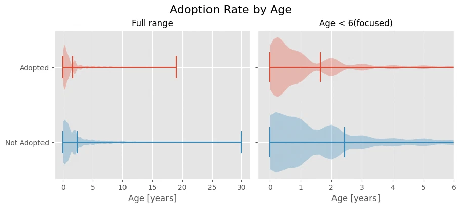
Non-adopted animals show up across the higher age buckets, while adopted ones skew younger.
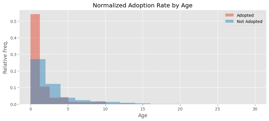
Once the counts are normalized (there are more non-adopted animals overall) the gap gets starker. Adoption is more common for younger animals.
fig, ax = plt.subplots(nrows=1, ncols=1, figsize=(9, 4), layout='constrained')
ax.set_title('Normalized Adoption Rate by Age')
ax.hist(adopted, 15, alpha=0.5, color=(226/255, 74/255, 51/255), label='Adopted', density=True)
ax.hist(notadopted, 15, alpha=0.5, label='Not Adopted', color=(52/255, 138/255, 189/255), density=True)
ax.set_xlabel('Age')
ax.set_ylabel('Relative Freq.')
ax.legend();
animal intake trends
is intake steady over the year, or are there busy and slow stretches?
time_ser = intakes_df['DateTime'].dt.strftime('%Y-%m').value_counts().sort_index()
fig, (ax1, ax2) = plt.subplots(2, 1, figsize=(9, 8), layout='constrained', gridspec_kw={'hspace': 0.1})
ax1.plot(time_ser)
ticks = list(time_ser.index)[3::12]
ticklabels = list(time_ser.index)[3+5::12]
ax1.set_xticks(ticks)
ax1.set_xticklabels(f"{tick[:-3]}" for tick in ticks)
ax1.set_title('Intakes over Time')
ax1.set_ylim(ymin=0)
ax1.set_xlabel('Year')
ax1.set_ylabel('Intake Count')
ax1.grid(which='major', axis='x', color='grey', linestyle='dotted', linewidth=0.6)

dt = intakes_df[['DateTime']].copy()
dt['Year'] = dt['DateTime'].dt.year
dt['Month'] = dt['DateTime'].dt.month
dt = dt.drop('DateTime', axis=1)
dt = dt.value_counts().groupby(['Year', 'Month']).sum()
means = dt.groupby('Month').mean()
bar_labels=['Jan', 'Feb', 'Mar', 'Apr', 'May', 'Jun', 'Jul', 'Aug', 'Sep', 'Oct', 'Nov', 'Dec']
(main, second, rest) = (red, '#ea8070', '#f3b6ad')
bar_colors = [rest, rest, rest, rest, main, main, second, second, second, second, rest, rest]
p = ax2.bar(means.index, means, width=0.6, color=bar_colors)
ax2.set_title('Average Monthly Intakes')
ax2.set_xticks(range(1, 13), labels=bar_labels)
ax2.set_xlabel('Month')
ax2.bar_label(p, fmt='%i', padding=-20, color='w')
ax2.set_yticks([])
ax2.set_ylim(ymin=0)
ax2.set_ylabel('Average Intake Count')
ax2.grid(visible=False, which='major', axis='both')
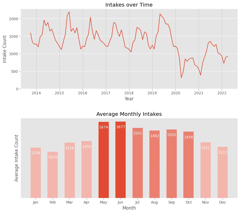
The first plot shows clear stretches of the year where intake jumps. The second pinpoints the busy season to roughly May through October, with about 500 more animals per month than the rest of the year. Winter and spring are the quiet months.
Note: the first plot also has a sharp drop at the end of 2019, probably the COVID-19 pandemic. Intake has been creeping back up since.
animal sterilization status
how does sterilization status shift between intake and outcome?
counts = merged.loc[:, ['Sterile_in', 'Sterile_out']].value_counts()
scounts = counts.reset_index().reindex([2, 0, 1]).reset_index(drop=True)
cnt_nst_in = scounts.loc[scounts['Sterile_in'] == False, 'count'].sum()
cnt_st_in = scounts.loc[scounts['Sterile_in'] == True, 'count'].sum()
scounts.loc[:2, 'frac'] = scounts.loc[:2, 'count']/cnt_nst_in
scounts.loc[2:, 'frac'] = scounts.loc[2:, 'count']/cnt_st_in
scounts['frac'] = scounts['frac']

cm = sns.light_palette(blue, as_cmap=True)
style = scounts.style.set_properties(**{'text-align':'center','font-size':'16px'})
style.set_caption('Animal Types by Origin').set_table_styles([dict(
    selector='caption', props=[('font-size', '150%'), ('text-align', 'right'), ('color', '#555')])])
style.format(precision=2)
| Sterile_in | Sterile_out | count | frac | |
|---|---|---|---|---|
| 0 | False | False | 32705 | 0.34 |
| 1 | False | True | 63245 | 0.66 |
| 2 | True | True | 45695 | 1.00 |
counts = merged.loc[:, ['Sterile_in', 'Sterile_out']].value_counts()
st_in, nst_in, st_out, nst_out = ('Sterile (in)', 'Non Sterile (in)', 'Sterile (out)', 'Non Sterile (out)')
cdict = {st_in: {st_out: counts.loc[True, True]},
         nst_in: {st_out: counts.loc[False, True], nst_out: counts.loc[False, False]}}
ax = alluvial.plot(cdict, figsize=(6, 4), fontname='Monospace', color_side=0,
                   alpha=0.9, colors=[red, blue], src_label_override=[st_in, nst_in], dst_label_override=[st_out, nst_out],
                   disp_width=True, wdisp_sep=3*' ', width_in=False, v_gap_frac=0.1)
ax.set_title('Animal Sex Transitions')

left, width = .25, .5
bottom, height = .25, .5
right = left + width
top = bottom + height
ax.text(0.5, 0.55, 'neutering', fontstyle='oblique',
        horizontalalignment='center', verticalalignment='center',
        transform=ax.transAxes, color='w', fontsize=14);
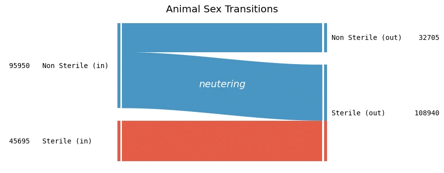
Again, sticking to animals that came in and left exactly once.
About 66% of non-sterile animals come in non-sterile and leave sterile. Nobody managed to reverse the procedure.
time spent in shelter
how long do animals usually stay?
durs = (merged['DateTime_out'] - merged['DateTime_in']).dt.days
print_univar_num_stats(durs)
None statistics

min:  0
max:  2948
mean:  63.78191485852635
median:  7.0
range:  2948

lower quartile:  3.0
upper quartile:  34.0
IQR:   31.0

variance:  40540.078983925494
std. variation:  201.345670387832
skewness:  6.139468243278622
kurtosis:  46.946690264259104
fig, (ax1, ax2) = plt.subplots(nrows=1, ncols=2, figsize=(9, 4), sharey=False, layout='constrained', gridspec_kw={'wspace': 0.1})
ax1.hist(durs)
ax1.set_title('Time Spent in Animal Care')
ax1.set_xlabel('Days')
ax1.set_ylabel('Count')
ax1.ticklabel_format(axis='y', style='sci', scilimits=(0,0), useMathText=True)

ax2.hist(durs[durs < 150], bins=50)
ax2.set_title('Focused (< 150 days)')
ax2.set_xlabel('Days')
ax2.ticklabel_format(axis='y', style='sci', scilimits=(0,0), useMathText=True)
durs.sort_values(ascending=False).head(5) / 360
176625    8.188889
90634     8.163889
31455     8.077778
171654    8.072222
177941    8.052778
dtype: float64
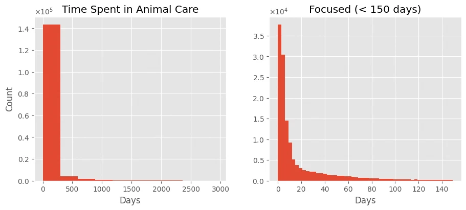
For animals that have already left, most stays are under 3 months, often under a month. A few stick around for up to 8 years, but the mean is 63 days and the median is just 7.
note: the y-axis in the right plot is on a different scale.
euthanasia frequency
is euthanasia frequency flat over time, or does it cluster?
counts = merged.loc[merged['Outcome Type'] == 'Euthanasia', 'DateTime_out']
fig, (ax1, ax2) = plt.subplots(nrows=2, ncols=1, figsize=(9, 8), sharey=False, layout='constrained', gridspec_kw={'hspace': 0.1})
ax1.set_title('Frequency of Euthanasia over Time')
time_ser = counts.dt.strftime('%Y-%m').value_counts().sort_index()
ax1.plot(time_ser, label='Real data', alpha=0.4)
ax1.plot(time_ser.rolling(window=12).mean(), label='Rolling average [annual]', linewidth=2.2)
ticks = list(time_ser.index)[3::12]
ticklabels = list(time_ser.index)[3+5::12]
ax1.set_xticks(ticks)
ax1.set_xticklabels(f"{tick[:-3]}" for tick in ticks)
ax1.set_ylim(ymin=0)
ax1.set_xlabel('Year')
ax1.set_ylabel('Euthanasia Procedure Count')
ax1.legend()

dt = merged.loc[merged['Outcome Type'] == 'Euthanasia', ['DateTime_out']].copy()
dt['Year'] = dt['DateTime_out'].dt.year
dt['Month'] = dt['DateTime_out'].dt.month
dt = dt.drop('DateTime_out', axis=1)
dt = dt.value_counts().groupby(['Year', 'Month']).sum()
means = dt.groupby('Month').mean()
bar_labels=['Jan', 'Feb', 'Mar', 'Apr', 'May', 'Jun', 'Jul', 'Aug', 'Sep', 'Oct', 'Nov', 'Dec']
(main, second, rest) = (red, '#ea8070', '#f3b6ad')
bar_colors = [rest, rest, main, second, second, second, rest, rest, rest, rest, rest, rest]
p = ax2.bar(means.index, means, width=0.6, color=bar_colors)
ax2.set_title('Frequency of Euthanasia each Month')
ax2.set_xticks(range(1, 13), labels=bar_labels)
ax2.set_xlabel('Month')
ax2.bar_label(p, fmt='%i', padding=-20, color='w')
ax2.set_yticks([])
ax2.set_ylim(ymin=0)
ax2.set_ylabel('Average Intake Count')
ax2.grid(visible=False, which='major', axis='both')
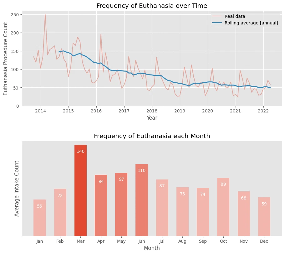
The moving average shows euthanasia procedures trending down since 2013, from about 150 a month to around 50.
the monthly averages still look high because the older data weights them up. March is the worst, around 140 procedures, and it stays around 100 for the next three months. the rest of the year is generally below 90 a month.