Analysis of crime data in Austria
I looked at crime records in Austria, using data from Eurostat. I started with the regional numbers for 2021, then compared the types of crimes and tried a few hypothesis tests.
data preprocessing
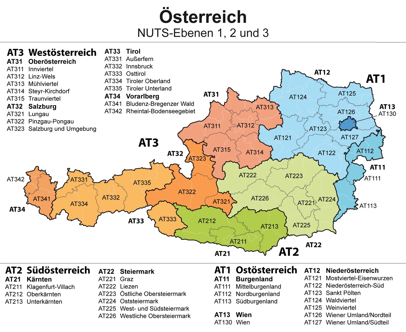
I used the NUTS 3 regions to split Austria into smaller areas.
# Load necessary libraries
library(eurostat)
library(ggplot2)
library(psych)
id = 'crim_gen_reg'
crim_data = get_eurostat(id=id)

# Filter for data from the year 2021
data_2021 = subset(crim_data, format(TIME_PERIOD, '%Y') == '2021')

# Filter for Austrian NUTS 3 regions
at_data = data_2021[grepl('^AT[0-9]{3}$', data_2021$geo), ]
df = subset(at_data, select = c(unit, iccs, geo, values))
df = label_eurostat(df)

# The subcategories 'Burglary of private residential premises' and
# 'Theft of a motorized land vehicle' are already included in 'Burglary' and 'Theft'.
# We will exclude them to avoid duplication.
df = subset(df, !(iccs %in% c('Burglary of private residential premises',
                              'Theft of a motorized land vehicle')))

# Separate data into absolute numbers and per 100k inhabitants
nr_df = subset(df, df$unit == 'Number', select = c(iccs, geo, values))
pht_df = subset(df, df$unit == 'Per hundred thousand inhabitants', select = c(iccs, geo, values))

# Aggregate data by crime category (iccs) and region (geo)
nr_iccs_df = aggregate(list(values = nr_df$values), list(iccs = nr_df$iccs), sum)
nr_geo_df = aggregate(list(values = nr_df$values), list(geo = nr_df$geo), sum)

pht_iccs_df = aggregate(list(values = pht_df$values), list(iccs = pht_df$iccs), mean)
pht_geo_df = aggregate(list(values = pht_df$values), list(geo = pht_df$geo), mean)
initial data exploration
first, the counts for 2021. Which crimes show up most, and where?
At this level, the regions are groups of political districts (Gruppen von Politischen Bezirken), as shown on the map above.
categories of criminal offenses
From 2008 onwards, the statistics include police-recorded offences for homicide, assault, sexual violence, robbery, burglary, (of which) burglary of residential premises, theft, (of which) theft of motorized land vehicle. [src]
rows = nr_iccs_df[order(-nr_iccs_df$values),]
row.names(rows) = 1:5
rows

theme_set(theme_gray(base_size = 14))
options(repr.plot.width=14, repr.plot.height=6)
ggplot(nr_iccs_df, aes(x=reorder(iccs, values), y=values)) + ggtitle('Categories of criminal offences') +
    geom_bar(stat='identity') + ylab('count') +
    geom_text(aes(label=values), hjust=-0.3) +
    coord_flip() + theme(axis.title.y = element_blank()) +
    expand_limits(y = c(0, 75000))
ggplot(pht_df, aes(x=reorder(iccs, values), y=values, fill=iccs)) +
    geom_boxplot(outlier.color='red', show.legend=F) + ylab('relative count [per 10^5 inh.]') +
    coord_flip() + theme(axis.title.y = element_blank()) +
    geom_jitter(color='black', size=0.1, alpha=0.8, show.legend=F)
| iccs | values | |
|---|---|---|
| <chr> | <dbl> | |
| 1 | Theft | 73213 |
| 2 | Burglary | 40385 |
| 3 | Assault | 34287 |
| 4 | Robbery | 2118 |
| 5 | Intentional homicide | 59 |
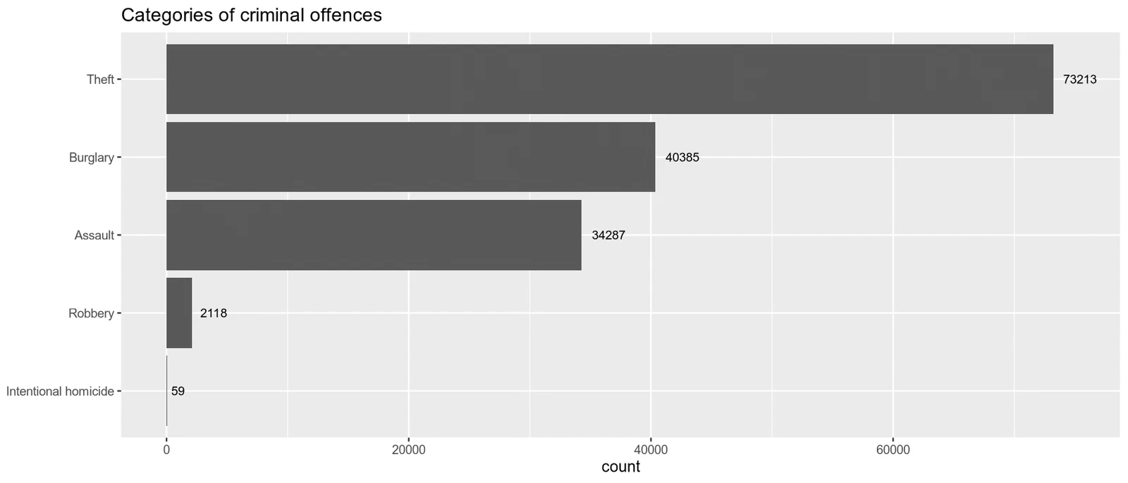
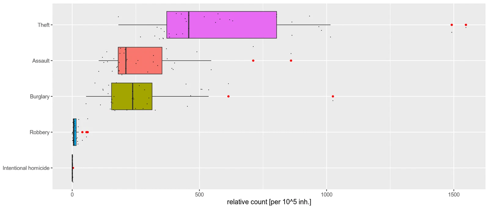
Theft dominates the counts: 73,213 cases, compared with 59 intentional homicides. I also plotted the numbers per 100,000 people to make the regions easier to compare. Even then, theft varies quite a bit. Wien and Linz-Wels stand out as outliers.
regions by NUTS 3 division
rows = merge(x = nr_geo_df, y = pht_geo_df, by = 'geo')
rows = rows[order(-rows$values.x),]
colnames(rows) <- c('geo', 'count', 'relative.count')
row.names(rows) = 1:35

cat('Top 5')
head(rows, 5)

cat('Bottom 5')
tail(rows, 5)

summary(nr_geo_df)
r = describe(nr_geo_df$values, skew=F, IQR=T, ranges=F)
rownames(r) = c('values')
r$var = c(var(nr_geo_df$values))
r[,c(2,4,7,6)]

ggplot(rows, aes(x=count/relative.count, y=count)) + geom_point() + ggtitle('Inhabitants v. Crime') +
    xlab('inhabitants [10^5]') + ylab('crime count')
ggplot(rows[rows$geo != 'Wien', ], aes(x=count/relative.count, y=count)) + geom_point() + ggtitle('Inhabitants v. Crime (w/o Wien)') +
    xlab('inhabitants [10^5]') + ylab('crime count')
Top 5
| geo | count | relative.count | |
|---|---|---|---|
| <chr> | <dbl> | <dbl> | |
| 1 | Wien | 63198 | 657.988 |
| 2 | Linz-Wels | 11245 | 376.068 |
| 3 | Graz | 8469 | 377.248 |
| 4 | Salzburg und Umgebung | 7600 | 409.668 |
| 5 | Innsbruck | 5587 | 357.274 |
Bottom 5
| geo | count | relative.count | |
|---|---|---|---|
| <chr> | <dbl> | <dbl> | |
| 31 | Liezen | 573 | 143.986 |
| 32 | Osttirol | 516 | 211.416 |
| 33 | Außerfern | 199 | 120.410 |
| 34 | Mittelburgenland | 164 | 87.576 |
| 35 | Lungau | 112 | 111.344 |
          geo            values
 Length:35          Min.   :  112
 Class :character   1st Qu.: 1034
 Mode  :character   Median : 1970
                    Mean   : 4287
                    3rd Qu.: 3352
                    Max.   :63198
| n | sd | var | IQR | |
|---|---|---|---|---|
| <dbl> | <dbl> | <dbl> | <dbl> | |
| values | 35 | 10540.04 | 111092439 | 2318.5 |
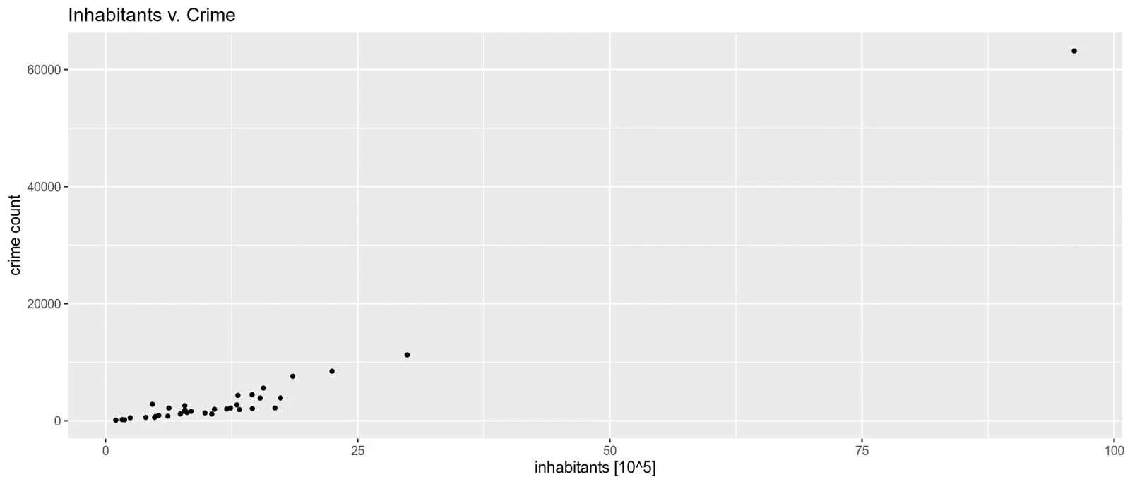
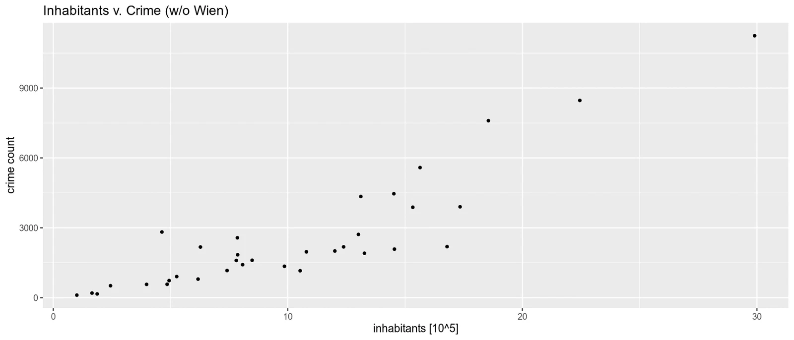
The largest counts are in Wien (63,198), Linz-Wels (11,245), and Graz (8,469). At the other end are Mittelburgenland (164) and Lungau (112). Population looks like a big part of this: more people, more recorded crimes. I’ll come back to that below.
rows = merge(x = nr_geo_df, y = pht_geo_df, by = 'geo')
rows = rows[order(-rows$values.y),]
colnames(rows) <- c('geo', 'count', 'relative.count')
row.names(rows) = 1:35
head(rows, 5)

options(repr.plot.height=6)
ggplot(pht_geo_df, aes(x=values)) +
    geom_histogram(bins=8) + xlab('Relative crime count') + ylab('Frequency') +
    geom_rug(aes(values, y = NULL), length = unit(0.02, "npc")) +
    geom_boxplot(outlier.color='red', show.legend=F, position = position_nudge(y = -0.2))
| geo | count | relative.count | |
|---|---|---|---|
| <chr> | <dbl> | <dbl> | |
| 1 | Wien | 63198 | 657.988 |
| 2 | Bludenz-Bregenzer Wald | 2822 | 609.134 |
| 3 | Salzburg und Umgebung | 7600 | 409.668 |
| 4 | Graz | 8469 | 377.248 |
| 5 | Linz-Wels | 11245 | 376.068 |
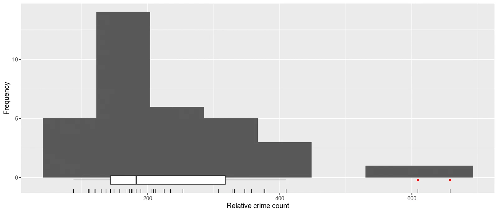
Dividing by population changes the picture. Bludenz-Bregenzer Wald and Salzburg und Umgebung have fairly low total counts, but come second and third after Vienna when I look at crimes per person.
analyzing the relationship between region and crime type
ct = xtabs(formula=values ~ geo + iccs, data=nr_df)
addmargins(ct)
| Assault | Burglary | Intentional homicide | Robbery | Theft | Sum | |
|---|---|---|---|---|---|---|
| Außerfern | 52 | 18 | 1 | 2 | 126 | 199 |
| Bludenz-Bregenzer Wald | 797 | 569 | 1 | 21 | 1434 | 2822 |
| Graz | 1807 | 2009 | 5 | 89 | 4559 | 8469 |
| Innsbruck | 1533 | 921 | 3 | 66 | 3064 | 5587 |
| Innviertel | 553 | 478 | 0 | 13 | 1042 | 2086 |
| Klagenfurt-Villach | 1138 | 948 | 2 | 43 | 2333 | 4464 |
| Liezen | 162 | 122 | 0 | 1 | 288 | 573 |
| Linz-Wels | 2373 | 3050 | 4 | 239 | 5579 | 11245 |
| Lungau | 25 | 18 | 0 | 0 | 69 | 112 |
| Mittelburgenland | 39 | 56 | 0 | 1 | 68 | 164 |
| Mostviertel-Eisenwurzen | 439 | 592 | 1 | 17 | 1134 | 2183 |
| Mühlviertel | 292 | 297 | 1 | 4 | 565 | 1159 |
| Niederösterreich-Süd | 971 | 1221 | 1 | 43 | 2108 | 4344 |
| Nordburgenland | 303 | 381 | 2 | 8 | 724 | 1418 |
| Oberkärnten | 227 | 137 | 2 | 2 | 431 | 799 |
| Östliche Obersteiermark | 528 | 391 | 0 | 11 | 913 | 1843 |
| Oststeiermark | 434 | 445 | 1 | 15 | 1016 | 1911 |
| Osttirol | 103 | 136 | 0 | 2 | 275 | 516 |
| Pinzgau-Pongau | 438 | 403 | 0 | 14 | 753 | 1608 |
| Rheintal-Bodenseegebiet | 1145 | 808 | 1 | 32 | 1897 | 3883 |
| Salzburg und Umgebung | 2027 | 1878 | 3 | 95 | 3597 | 7600 |
| Sankt Pölten | 466 | 711 | 3 | 37 | 1356 | 2573 |
| Steyr-Kirchdorf | 336 | 444 | 2 | 8 | 810 | 1600 |
| Südburgenland | 132 | 118 | 1 | 2 | 324 | 577 |
| Tiroler Oberland | 264 | 127 | 2 | 59 | 457 | 909 |
| Tiroler Unterland | 831 | 373 | 2 | 21 | 1491 | 2718 |
| Traunviertel | 443 | 516 | 1 | 16 | 1030 | 2006 |
| Unterkärnten | 315 | 241 | 0 | 6 | 606 | 1168 |
| Waldviertel | 449 | 522 | 0 | 10 | 989 | 1970 |
| Weinviertel | 400 | 673 | 3 | 17 | 1084 | 2177 |
| West- und Südsteiermark | 385 | 314 | 1 | 9 | 640 | 1349 |
| Westliche Obersteiermark | 173 | 154 | 0 | 4 | 405 | 736 |
| Wien | 13669 | 19685 | 14 | 1170 | 28660 | 63198 |
| Wiener Umland/Nordteil | 399 | 583 | 1 | 12 | 1198 | 2193 |
| Wiener Umland/Südteil | 639 | 1046 | 1 | 29 | 2188 | 3903 |
| Sum | 34287 | 40385 | 59 | 2118 | 73213 | 150062 |
The table mostly repeats what I saw above: bigger regions and common crimes have bigger counts. The mix of crime types looks fairly similar across regions, though. I wanted to check whether that holds up in a test.
fisher’s exact test
I used Fisher’s exact test at the 5% level to check whether the mix of crime types depends on the region. Some cells have zero counts, which the test can handle.
\(H_0\): Each row (region) is a realization of the same distribution (crime category), i.e., \(p_{ij} = p_{i:} \cdot p_{:j}\) for \(i=1,\ldots,35\) and \(j=1,\ldots, 5\).
\(H_A\): \(H_0\) is not true.
fish = fisher.test(ct, simulate.p.value = TRUE)
fish
  Fisher's Exact Test for Count Data with simulated p-value (based on
  2000 replicates)

data:  ct
p-value = 0.0004998
alternative hypothesis: two.sided
The test rejects the null hypothesis at 5%. So the mix of crime types does differ across regions, even if that wasn’t obvious from a quick look at the table.
hypothesis testing
hypothesis 1: correlation between population and crime count
ggplot(rows, aes(x=count/relative.count, y=count)) + geom_point() + ggtitle('Inhabitants v. Crime') +
    xlab('inhabitants [10^5]') + ylab('crime count')
ggplot(rows[rows$geo != 'Wien', ], aes(x=count/relative.count, y=count)) + geom_point() + ggtitle('Inhabitants v. Crime (w/o Wien)') +
    xlab('inhabitants [10^5]') + ylab('crime count')
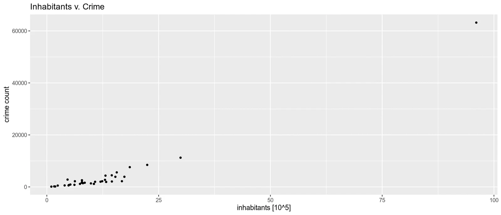
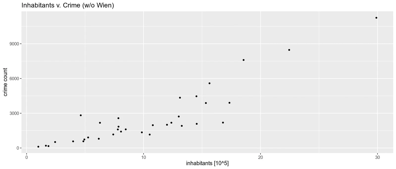
Back to population. The plots suggested that more populous regions have more recorded crimes, so I checked that with Spearman’s rank correlation at the 5% level.
\(H_0 :\) There is zero correlation between the number of inhabitants and the frequency of crime in a region: \(\rho_S = 0\)
\(H_A :\) There is a positive correlation between the number of inhabitants and the frequency of crime in a region: \(\rho_S \> 0\)
x = rows$count/rows$relative.count
y = rows$count

round(cor(x, y, method='spearman'), 4)
cor.test(x, y, method='spearman', alternative='greater')
0.8641
  Spearman's rank correlation rho

data:  x and y
S = 970, p-value = 1.586e-08
alternative hypothesis: true rho is greater than 0
sample estimates:
       rho
0.8641457
I got a Spearman correlation of 0.86, a strong positive relationship. The test rejects zero correlation at 5%, which agrees with the plots: the more populous regions tend to have more recorded crimes.
hypothesis 2: comparing homicide rates in austria and slovakia
cd = crim_data[grepl('^AT[0-9]{3}$', crim_data$geo), ]
cd = label_eurostat(cd, fix_duplicated = TRUE)
cd = subset(cd, unit == 'Number')
cd = subset(cd, freq == 'Annual')
cd = subset(cd, iccs == 'Intentional homicide')
cd = aggregate(list(values = cd$values), list(TIME_PERIOD = cd$TIME_PERIOD), sum)
mean.AT = mean(cd$values)
median.AT = median(cd$values)
colnames(cd) = c('year', 'AT')
cd.AT = cd

cd = crim_data[grepl('^SK[0-9]{3}$', crim_data$geo), ]
cd = label_eurostat(cd, fix_duplicated = TRUE)
cd = subset(cd, unit == 'Number')
cd = subset(cd, freq == 'Annual')
cd = subset(cd, iccs == 'Intentional homicide')
cd = aggregate(list(values = cd$values), list(TIME_PERIOD = cd$TIME_PERIOD), sum)
mean.SK= mean(cd$values)
median.SK= median(cd$values)
colnames(cd) = c('year', 'SK')
cd.SK = cd

cd.AT$SK = cd.SK$SK
cd = cd.AT
cd

cat('AT mean, median: ', mean.AT, ',', median.AT, '\n')
cat('SK mean, median: ', mean.SK, ',', median.SK)
| year | AT | SK |
|---|---|---|
| <date> | <dbl> | <dbl> |
| 2008-01-01 | 58 | 94 |
| 2009-01-01 | 51 | 84 |
| 2010-01-01 | 59 | 87 |
| 2011-01-01 | 82 | 96 |
| 2012-01-01 | 88 | 75 |
| 2013-01-01 | 62 | 78 |
| 2014-01-01 | 40 | 72 |
| 2015-01-01 | 42 | 48 |
| 2016-01-01 | 49 | 59 |
| 2017-01-01 | 61 | 79 |
| 2018-01-01 | 73 | 67 |
| 2019-01-01 | 74 | 76 |
| 2020-01-01 | 54 | 63 |
| 2021-01-01 | 59 | 55 |
AT mean, median:  60.85714 , 59
SK mean, median:  73.78571 , 75.5
For 2008 to 2021, I got median annual homicide counts of 59 in Austria and 75.5 in Slovakia. I used a one-sided Mann-Whitney U test to check whether the Austrian counts tend to be lower, without assuming a normal distribution. Let \(\tilde{\mu}*\text{AT}\) and \(\tilde{\mu}*\text{SK}\) be the true respective median values.
\(H_0: \tilde{\mu}*\text{AT} = \tilde{\mu}*\text{SK}\)
\(H_A: \tilde{\mu}*\text{AT} < \tilde{\mu}*\text{SK}\)
wilcox.test(cd$AT, cd$SK, alternative='less', exact=F)
  Wilcoxon rank sum test with continuity correction

data:  cd$AT and cd$SK
W = 50, p-value = 0.01449
alternative hypothesis: true location shift is less than 0
The test rejects the null hypothesis at 5%, supporting the lower homicide counts in Austria.
hypothesis 3: normality of homicide data in vienna
cd = crim_data
cd = subset(cd, unit == 'NR')
cd = subset(cd, freq == 'A')
cd = subset(cd, geo == 'AT13')
cd = label_eurostat(cd)
cd = subset(cd, iccs == 'Intentional homicide')

ggplot(cd, aes(x=values)) + xlab('Count of intentional homicide') + ylab('Density') +
    geom_histogram(aes(y=after_stat(density)), colour = 1, fill = 'white', bins=5) +
    stat_function(fun=dnorm,
                  args=list(mean=mean(cd$values), sd=sd(cd$values)),
                  colour='red', lwd=2, linetype='dashed')
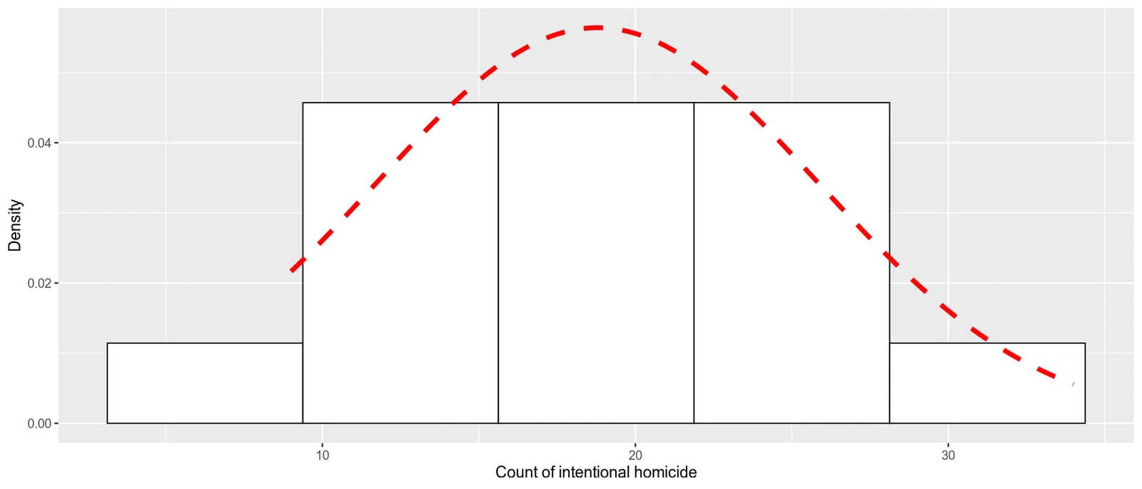
Finally, I checked whether the annual homicide counts in Vienna look normally distributed. I used a Shapiro-Wilk test and a Q-Q plot.
\(H_0\): The annual number of homicides in the Vienna region comes from a normal distribution.
\(H_A\): The annual number of homicides in the Vienna region does not come from a normal distribution.
shapiro.test(cd$values)

options(repr.plot.height=5)
ggplot(cd, aes(sample=values)) +
        stat_qq(distribution=qnorm, show.legend=T) +
        stat_qq_line(distribution=qnorm, show.legend=F)
  Shapiro-Wilk normality test

data:  cd$values
W = 0.94623, p-value = 0.5039
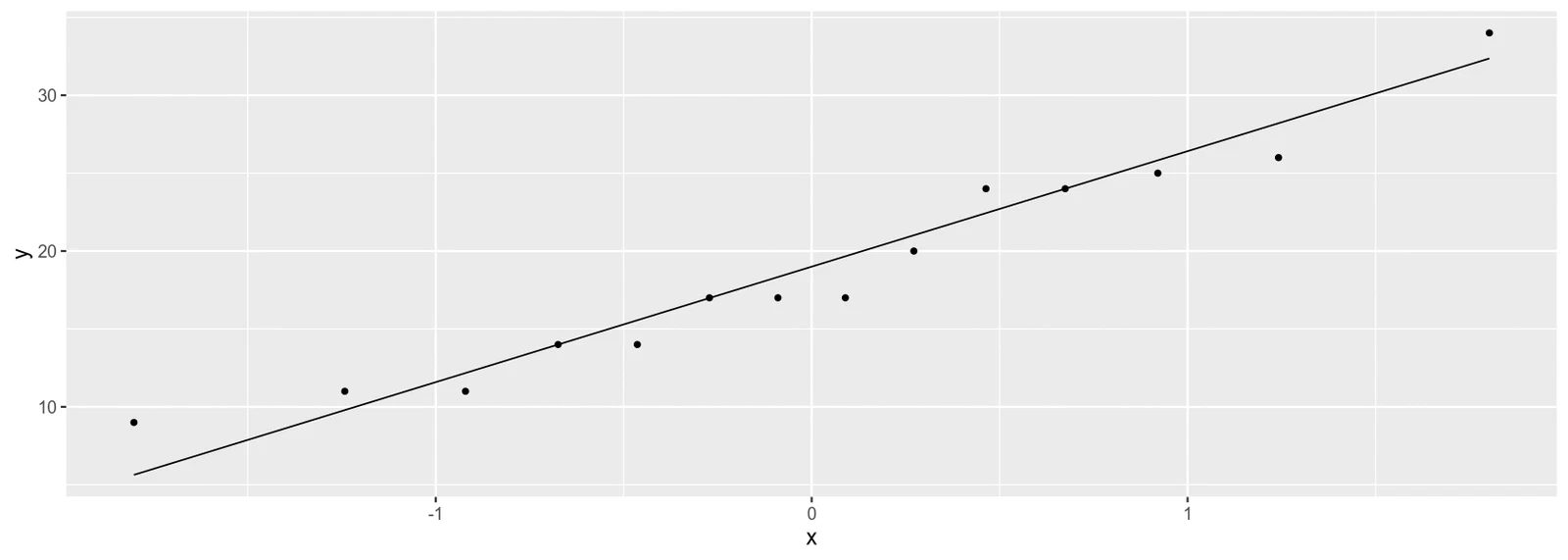
This time the test doesn’t reject normality at 5%. The Q-Q plot agrees: the points stay fairly close to the line.